

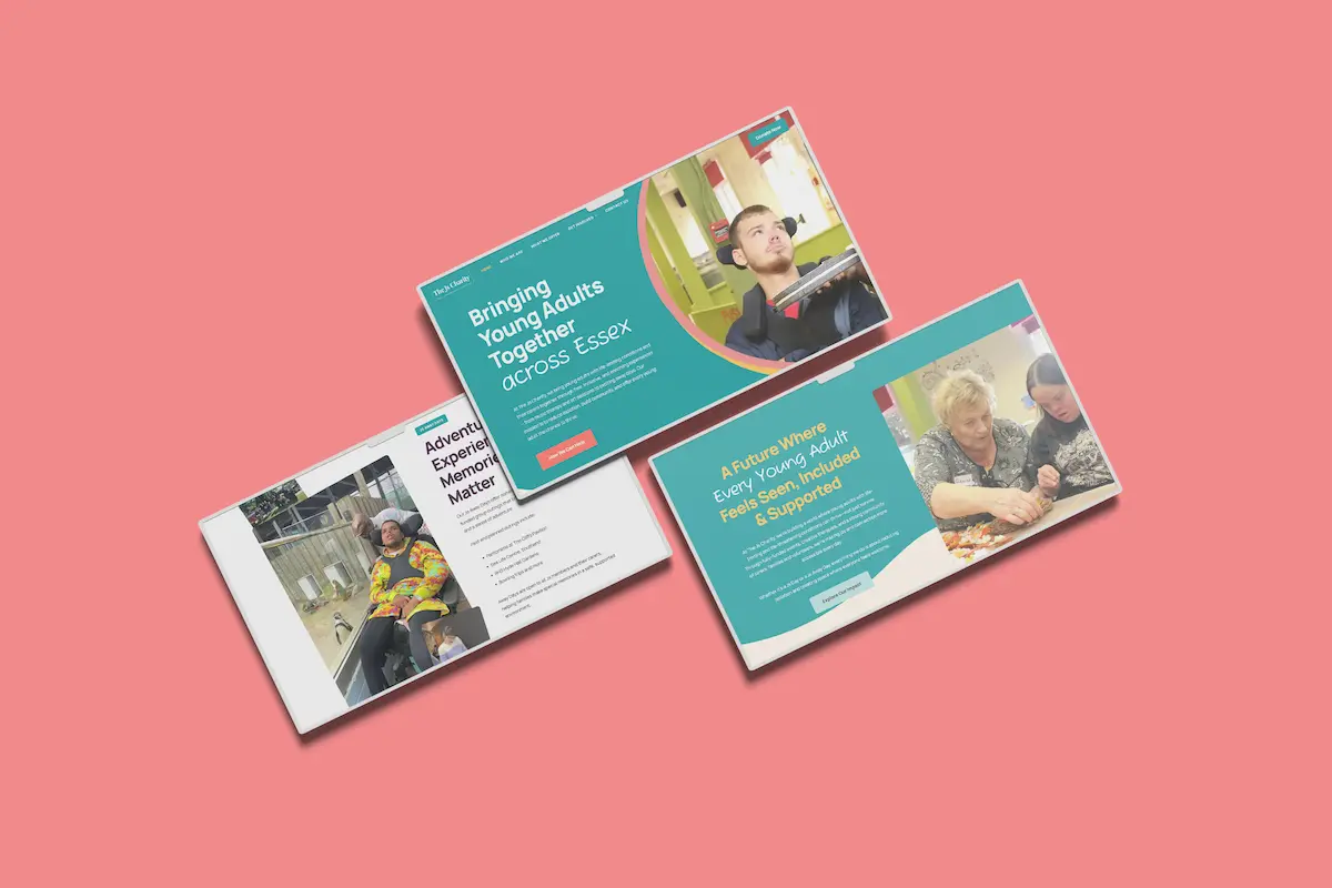
A charity website has a lot of jobs to do.
It may need to help someone access support, encourage a supporter to donate, recruit volunteers, promote fundraising events, provide information for professionals and demonstrate impact to funders or corporate partners.
And all of those people could be visiting the same website for completely different reasons.
That is what makes charity website design more complicated than simply deciding which pages to include.
A good charity website should clearly explain what the organisation does, make services easy to access, demonstrate impact and provide straightforward ways to donate, volunteer, fundraise or get involved. It should also be accessible, mobile-friendly, secure, easy to navigate and designed around the needs of the charity’s different audiences.
The exact requirements will naturally vary between organisations.
But the principle should remain the same.
Your website should be designed around what people need to do, not around your internal organisational structure.
Start with the people who need to use your website
Before thinking about pages, menus or design, think about your audiences.
Most charities don’t have one.
Depending on your organisation, your website might need to support:
- People accessing your services.
- Family members and carers.
- Existing and prospective donors.
- Volunteers.
- Fundraisers.
- Healthcare or other professionals.
- Corporate supporters.
- Trusts and foundations.
- Community partners.
Each audience arrives with a different objective.
Someone looking for support may need to understand whether they’re eligible for your services and how to access them.
Someone considering volunteering wants to know what opportunities are available and what commitment is involved.
A potential donor wants to understand the difference their contribution could make.
A healthcare professional may simply need to know how to make a referral.
Trying to communicate with all of these audiences in exactly the same way rarely creates a good experience.
Instead, the structure of your website should help people quickly identify the journey that’s relevant to them.
This is why we encourage charities to consider their website as part of their wider charity marketing strategy, rather than treating it as an isolated design project.
Before asking what your website should look like, ask:
Who needs to use it, and what do they need to achieve?
The answer should influence almost everything that follows.
Make it immediately clear what your charity does
Someone shouldn’t need to understand your organisation before they can understand your website.
Within the first few seconds of arriving, a new visitor should be able to establish what your charity does, who you support and, where relevant, where you operate.
That sounds obvious.
In practice, organisations can become so familiar with their own terminology that their website starts communicating from an internal perspective.
Mission statements, campaign slogans and sector-specific terminology might make perfect sense to your team, but they don’t always explain what you actually do.
Your mission and values still matter.
But clarity comes first.
A hospice, for example, shouldn’t assume everyone arriving on its website understands what hospice care involves. A specialist health charity shouldn’t assume a newly diagnosed person understands the terminology surrounding their condition.
Start with the visitor’s level of knowledge, not your own.
Your homepage should then provide clear routes towards the most important areas of the website.
That could include accessing support, making a donation, volunteering, fundraising or learning more about your impact.
The homepage doesn’t need to contain everything.
Its job is to help people understand where to go next.
The same principle applies beyond the homepage too.
Someone discovering your charity through Google, social media or an AI-powered search platform may arrive directly on an internal page. Important pages should therefore provide enough context to make sense independently.
Make accessing your services straightforward
For charities providing services, helping people access those services should be one of the website’s most important jobs.
Information should be written around the questions someone is likely to have.
What support is available?
Who is it for?
Am I eligible?
Do I need a referral?
Can I refer myself?
Where is the service provided?
What happens after I contact you?
Who can I speak to if I’m unsure?
The answers will vary enormously between charities, but the principle doesn’t.
Don’t make someone work to understand how to get help.
This becomes particularly important where someone may already be dealing with a difficult, emotional or unfamiliar situation.
Avoid unnecessary jargon and explain processes clearly.
If healthcare professionals, schools, local authorities or other organisations can make referrals, consider whether they need their own information or referral journey rather than expecting them to navigate content primarily written for service users.
And think carefully about the calls to action you provide.
Sometimes a contact form is appropriate. Sometimes somebody needs a telephone number. Sometimes an online referral form will create the simplest journey.
The website should reflect how people genuinely access your services.
Give supporters clear ways to get involved
Not everybody who wants to support your charity will want to do so in the same way.
Some people will be ready to donate immediately.
Others might want to volunteer, attend an event, fundraise, become a corporate partner or simply stay connected to your work.
Your website should make those opportunities easy to discover.
For fundraising charities, the donation journey deserves particular attention.
Making a donation should be straightforward, especially on mobile devices. Consider how you present one-off and regular giving, suggested donation amounts, Gift Aid and different payment methods.
But don’t focus exclusively on the payment form.
The content surrounding it matters too.
Why should someone donate?
What will their contribution help achieve?
What difference could £10, £25 or £50 make?
Why does your charity need their support now?
The strongest donation journeys connect the reason to give with an easy way to act.
And the relationship shouldn’t end once somebody reaches the thank-you page.
Confirmation emails, impact communications and ongoing stewardship can help turn an individual donation into a much longer relationship. We’ve explored this further in our article on the role of digital marketing in donor retention.
The same thinking should apply to volunteering.
If volunteers are important to your organisation, explain what opportunities exist, what commitment is required, where they’re based, what training or support is provided and what happens after somebody applies.
Paid campaigns through channels such as Meta Ads can help charities recruit volunteers, but the website still has to turn that interest into an application.
Marketing can bring people to your website.
The website still needs to do something with that attention.
Show people the difference their support makes
Charities regularly talk about impact.
Your website needs to demonstrate it.
That doesn’t mean filling every page with statistics.
Numbers can provide useful evidence, but they become much more meaningful when visitors understand the story behind them.
For example, saying your charity supported 2,000 people last year tells us something about scale.
Explaining what that support enabled those people to do tells us something about impact.
The strongest charity websites often combine the two.
You might use:
- Impact statistics.
- Case studies.
- Stories from people you’ve supported.
- Volunteer experiences.
- Supporter stories.
- Annual or impact reports.
- Outcomes from specific projects.
- Videos and photography.
This content can support much more than fundraising.
It can give prospective service users confidence in your organisation, help volunteers understand why their contribution matters, provide evidence for potential funders and demonstrate credibility to corporate partners.
Real stories can be particularly powerful, but they need to be handled responsibly.
Consent, safeguarding and dignity should always come before marketing value. People shouldn’t simply become a fundraising asset because their story is compelling.
Good charity storytelling should represent people’s experiences authentically while helping audiences understand the wider difference your organisation makes.
Build trust throughout the website
People may be asked to give your organisation their money, time, personal information or trust at an incredibly important point in their lives.
Your website needs to give them confidence.
Some of that comes from design.
Much more comes from transparency.
Visitors should be able to understand who sits behind the organisation and find important information without having to search extensively for it.
That could include your leadership team, trustees, charity registration details, annual reports, governance information, contact details, policies, safeguarding information and relevant accreditations or memberships.
Your About section has an important role here.
It shouldn’t simply repeat your mission statement. It should help people understand the organisation behind the work, why it exists and why they can trust it.
Legal and data protection information matters too.
Depending on your organisation and activities, that could include privacy information, cookie controls, terms and conditions, fundraising disclosures and accessibility information.
The Charity Commission and Information Commissioner’s Office provide official guidance charities can refer to when considering their regulatory and data protection responsibilities.
Trust isn’t created by a single page labelled “Governance”.
It is reinforced throughout the entire website.
Make sure people can actually find and use your website
Having excellent information is of limited value if the people who need it cannot find or access it.
That means a good charity website needs strong foundations behind the content.
Search engine optimisation can help people discover your organisation when they’re actively looking for services, support, volunteering opportunities or information.
This is also becoming relevant beyond traditional Google results.
AI-powered search experiences are changing how people discover information online, which makes clear, authoritative and genuinely useful website content increasingly important. We’ve explored this further in our guide to optimising your website for AI search.
Your website should answer the questions your audiences are genuinely asking.
That might mean creating useful content around your services, conditions you support, fundraising, volunteering or other areas where your organisation has real expertise.
But visibility is only one part of the equation.
The website also needs to be accessible.
Charity websites can be used by people with a wide range of visual, hearing, motor and cognitive needs. Accessibility therefore shouldn’t be viewed as an optional enhancement at the end of a website project.
Clear headings, appropriate colour contrast, keyboard navigation, alternative text, properly labelled forms, video captions and readable typography can all contribute towards a more inclusive experience.
The Web Content Accessibility Guidelines (WCAG) provide internationally recognised recommendations for making web content more accessible.
Mobile experience matters just as much.
Someone should be able to donate, register for an event, access service information or complete a volunteer application from their phone without fighting against the website.
And it needs to load quickly.
Large images, unnecessary scripts, excessive plugins and poorly configured websites can all affect performance. We’ve covered practical steps charities can consider in our guide on how to reduce your WordPress website size.
A beautiful website that is slow, inaccessible or difficult to use isn’t a successful website.
Your website needs ongoing attention after launch
A new website launch can feel like the end of a large project.
In reality, it’s the beginning of the website’s operational life.
Content changes.
Services evolve.
Staff members leave.
Events finish.
Campaigns launch.
WordPress, themes and plugins receive updates.
Links break.
Forms stop working as expected.
Without ongoing attention, even a well-built website gradually becomes less accurate and less effective.
Charities should therefore have clear responsibility for keeping content and technology maintained.
That might involve internal teams, external WordPress support and maintenance, or a combination of both.
Regular reviews are also an opportunity to ask whether the website is still supporting the organisation effectively.
Are people finding the right information?
Are there common questions the website doesn’t answer?
Have new services been introduced?
Are old campaigns still accessible through Google?
Do important forms still work?
Is the website still performing well across mobile devices?
A charity website shouldn’t remain unchanged for three years and then suddenly need another redesign.
Continuous improvement is usually a much better approach.
Measure what your website is actually achieving
Website traffic can be useful.
But 10,000 visitors doesn’t necessarily mean your website is performing better than one receiving 5,000.
What did those visitors actually do?
For a charity, meaningful website outcomes might include:
- Donations.
- Volunteer applications.
- Service enquiries.
- Referrals.
- Event registrations.
- Newsletter sign-ups.
- Fundraising registrations.
- Telephone calls.
Tools such as Google Analytics 4 and Google Tag Manager can help charities measure these actions and understand which marketing channels are contributing towards them.
This becomes especially important when you’re investing money in Google Ads, Meta campaigns, SEO or other marketing activity.
If a fundraising campaign generates 3,000 website visits but only two donations, increasing the advertising budget may not be the first thing to fix.
The problem could be the audience.
It could be the campaign.
But it could also be the website journey.
That is why website performance shouldn’t be assessed in isolation.
The website sits at the centre of your wider digital marketing activity, connecting discovery with action.
A charity website should do more than look good
There isn’t a universal template for the perfect charity website.
A small community charity won’t need the same functionality as a national organisation delivering multiple services across the UK.
Nor should it.
What matters is whether the website supports what the organisation is actually trying to achieve.
Someone needing help should be able to find it.
Someone inspired by your work should be able to support it.
A prospective volunteer should be able to understand what’s involved and apply.
A professional should be able to make a referral.
A potential funder should be able to see the difference you’re making.
And the marketing activity you’re investing in should have somewhere effective to send people.
That is what makes a charity website valuable.
At Blake Mark Productions, we design and develop charity websites around the wider objectives of the organisations we work with.
Rather than starting with how a website should look, we start by understanding who needs to use it, what you need them to do and how your website fits into your wider marketing, fundraising and communications strategy.
If your charity is considering a new website or questioning whether your existing website is still doing what you need it to do, you can book a free discovery call with our team below.